website names:
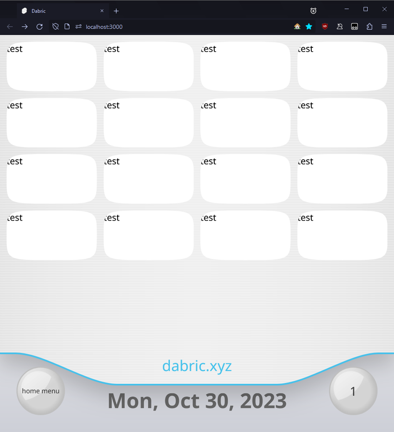
- v1: my initial website under dabric.xyz. it was the one with the overall glassy aesthetic and the navigation at the bottom.
- v2: as of writing, the current version. its overall greenish and has the navigation at the top with a gradient.
- revweb: the version this page is about
16 January 2024
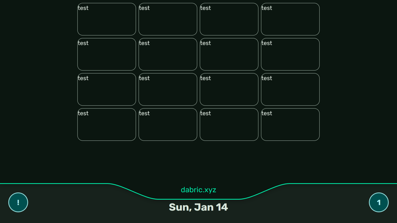
feature: flat.
if you have a phobia for flat design, assuming you didn't see the thumbnail now's your chance to look away!!!!
why
as much as i like the wii, i feel ive gone too much in the direction of "funny console" than what I actually want to do. i also suck tremendously at realism and hate remaking the wii's realistic assets. so now that everything is mostly flat, i dont have to worry about that. also nintendo scary
sorry if you like that it looked like the wii.
to be clear, the majority of the layout is staying. i dont see a reason to replace the posts or channels. i love how they work.
material 3
the new design internally uses material 3's coloring system. doesn't mean much to the end user, and my website currently does not support switching colors on the fly (i dont really see a point to letting it anyway).
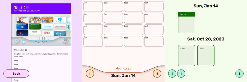
besides that, here's the website with different source colors:
the font
its rubik. thought it looked fitting.
feature: dark mode
there's now a dark mode. not much else to say.
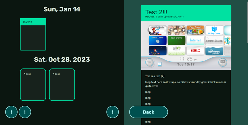
feature: posts have been refactored
i gutted out the old system and coded up the new one. and now it's there.
- you can now make any type of posts in any type of lists. before, it was only markdown content.
- component shown on open is now easier to change.
- a component is used for the post icon instead of an image.
- the post viewer is now separate from the postboard. so, clicking a link to one of my posts won't also load in the code for the postboard.
future: about moving
i think this will be the fastest to move. the content on v2 is mostly just markdown files and per-page svelte components, so i cant imagine that migration would be terrible.
game plan:
- get tags, pagination, and channels fully working as intended
- make a bunch of placeholder channels.
- ex: the links channel (along with others) would be a pretty basic looking channel. it'll also just be a post that's literally just the links page from v2.
- publish revweb, replacing v2.
- go through each channel and spice things up.
- ex: the links channel would get an actual banner and be moved onto its own site. in short, it'll now look like a channel with a start button that does what you expect it to do.
when i say separate site, i dont mean like
links.dabric.xyz. just a separate sveltekit website that still uploads onto dabric.xyz, just perhaps under like /links.4 January 2024
well its 2024. not much to show in terms of stuff functioning, but i do have more planned that i just want to share.
speaking of the new year, the date at the bottom now has one since its no longer 2023. lol
you may notice the channels are in a grid. ill get to that in a bit.
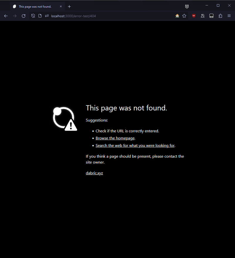
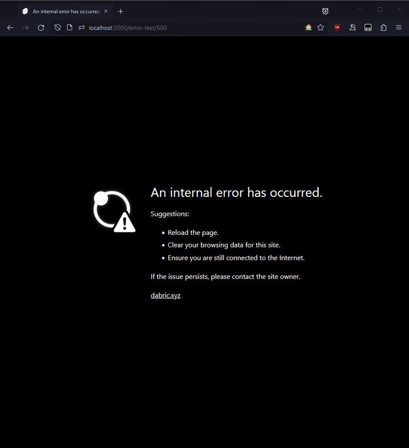
feature: an error page
it's simple, but i like it. the "search the web" link searches my website via google with whats in the url, so "post/test" would be "site:dabric.xyz post test".
here's the page for a 500:
for those that hate vague error messages, it shows the error in the console. i thought that was a good spot for it, as the average person or even a developer probably wouldn't know what to do with something like
Uncaught TypeError: Cannot read properties of undefined (reading 'push').500?i'm using sveltekit, and sveltekit can sometimes "500" in the browser. an example would it be its router trying to load a page but encountering an error of some sort. like a mess up on my end, or in some rare cases being knocked offline.its a bit of an oddity for a neocities website, but whatever.
planned feature: more with posts
refactor
how posts are internally handled aren't the greatest, so i'm reworking it. not going to get into the nitty-gritty, but in the end, it'll be significantly easier to generate lists of posts with pagination and create new post types.
profile pictures
i like them! while they also represent you, i think they also represent different eras of you. a different pfp just creates a new vibe.
thus posts will show profile pictures. they're also immutable; if i make a new post, the pfp on that post will never change even when i change my current pfp. thats to keep the "era" of me with the content.
more post types
- letter: long form written content
- note: short form written content. was previously a memo, but its kinda a weird word to use when 90% of the time its gonna be a shower thought
- image: an image with a caption. wow!
- link: a link. the indie web equivalent of retweeting?
- pfp change: shown when i change my profile picture
- commit: shows git commits. when clicked on, it shows a list of all git commits. that's where the list generating part of this refactor comes in!
planned feature: more with channels
hover previews?
the channel previews are fun and all, but they dont really show the content that in depth. ik some people like the rabbit-hole feeling when on a neocities website, but i like having everything easily accessible. (thats why i like the channels so much!)
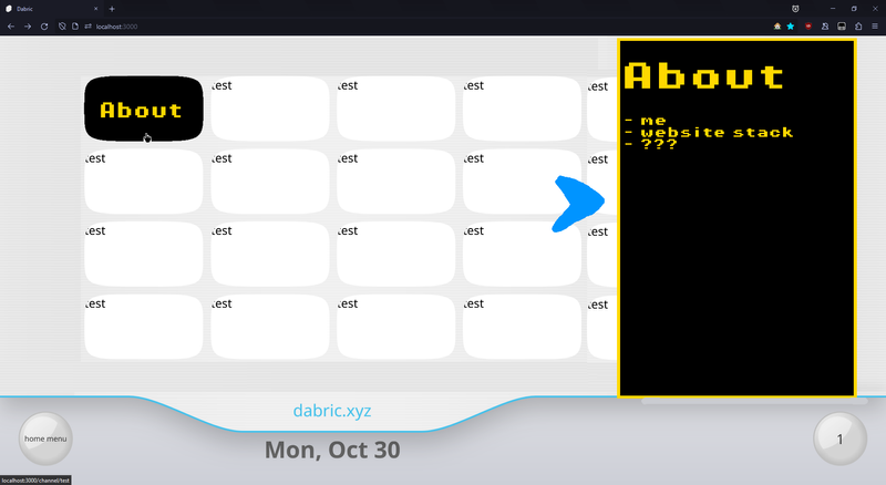
mockup:
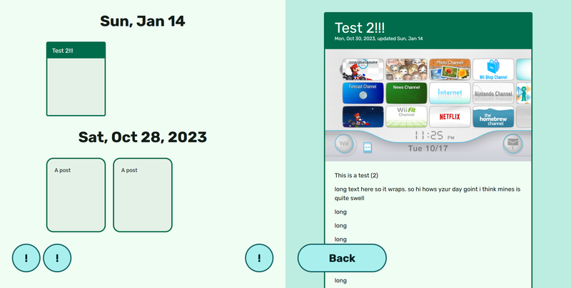
so the channels are pages again, and the next page can once again appear obscured as its now going under the hover preview instead of the edge of the screen. yay!
but i still don't think this is a perfect solution. it would make way more functional sense to have this appear under the mouse. in the mockup, the user's eyes would have to go from the left to the right, and then back to the left to move the mouse. O_o
the clock, or lack of
im against a clock as it suggests that the date below is current when its not. its the last published/updated post.
the dabric.xyz works fine, and it also acts as a watermark of sorts. like how some platforms put their brand under the notch on iphones so its included whenever they take a screenshot.
not sure of what instead of the clock tho. i'm thinking something fun (and asynchronously loaded) like how far you've moved the mouse or something. it could also just be a button to open the home menu.
25 December 2023
well its christmas
feature: channels
the one and only.
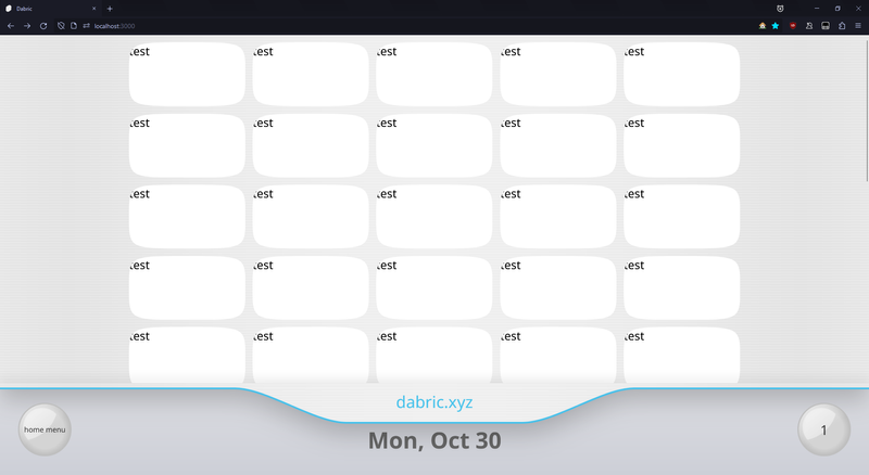
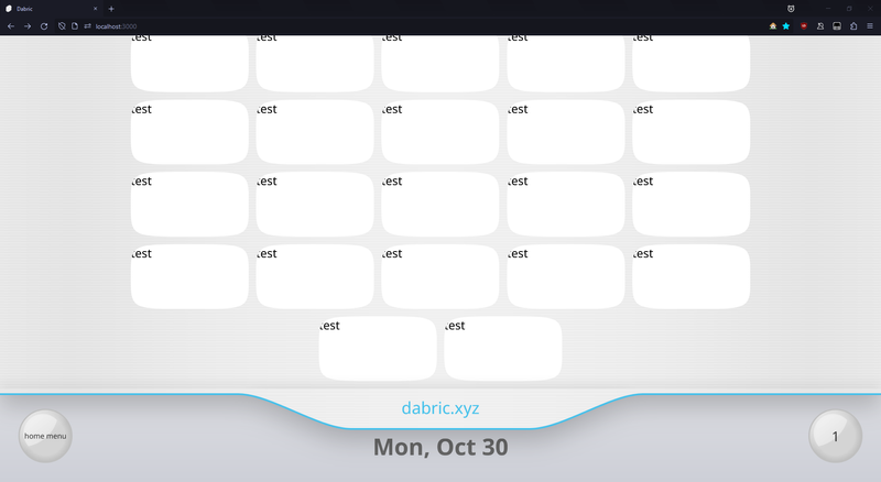
the scrolling
it scrolls instead of going left-to-right. this is just for easy responsiveness, as if the screen is too wide or to narrow, what do you do?
however, this method also results in some spare channels at the bottom. and also that shadow. i think it just looks terrible.
more columns of channels
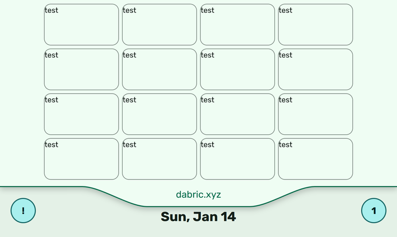
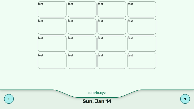
the usual way the wii did it, 4x4 scaled to cover the screen, feels like it was designed for a television screen. on a monitor it felt too large in my opinion. however, i get dead space when i simply downscale the channels. so now there's 5 columns.
i may revisit this. maybe i could just stick with 4 and cover the sides, and that could solve the previous issue as well.
channel borders
a major current eyesore are the channel borders. they're more round than usual, and thats not intentional. i just don't know how to get something like this shape as an svg path:
as of 15 january 2023, i am staying with a rectangle with rounded corners.
channel banners
on my website, a channel banner is just a mounted svelte component. svgs are used to scale the component like so:
- html
<svg
	viewBox="0 0 160 88"
	xmlns="http://www.w3.org/2000/svg"
	preserveAspectRatio="none"
>
	<foreignObject x="0" y="0" width="160" height="88">
		<div>test</div>
	</foreignObject>
</svg>
so to scale a banner channel, there's no javascript math and what feels like abusing
transform: scale(1). you just width="100" the svg!when i posted that method as an answer on stackoverflow i got this comment:
thought you all would appreciate that.
internal: improvements to page loading
now everything doesn't load in at once.
before, if you were just viewing a post, the channel list would also load in and even mount. that's not good for performance! first, some context as to why it was like this.
animations are great. i love them. svelte seems to be known for its animations system, but i found it too limiting. it needed to know the duration of an animation, which made animations with an undefined length (like springs) impossible to do.
furthermore, if you declare a global animation (which i need for stuff like the contents of the postboard fading in), its always global. and that reduces flexibility for me. there's also a bug that will cause your page to never unmount when using animations in a specific way. ive encountered that numerous times in the past; v1 and v2 both suffered from it.
so instead of using svelte's built-in animations, i just gave each component a boolean and they animated themselves.
to solve the loading issue, i created a new system. pages instead are the ones that import the component, but this time, they push the component into an array. when the page unmounts, that component is told to animate out and then destroy itself. works great, and animations aren't affected.
12 December 2023
this page is now actually in my website! horray!
what's now here
- a spinner for when the page loads more than 200ms:
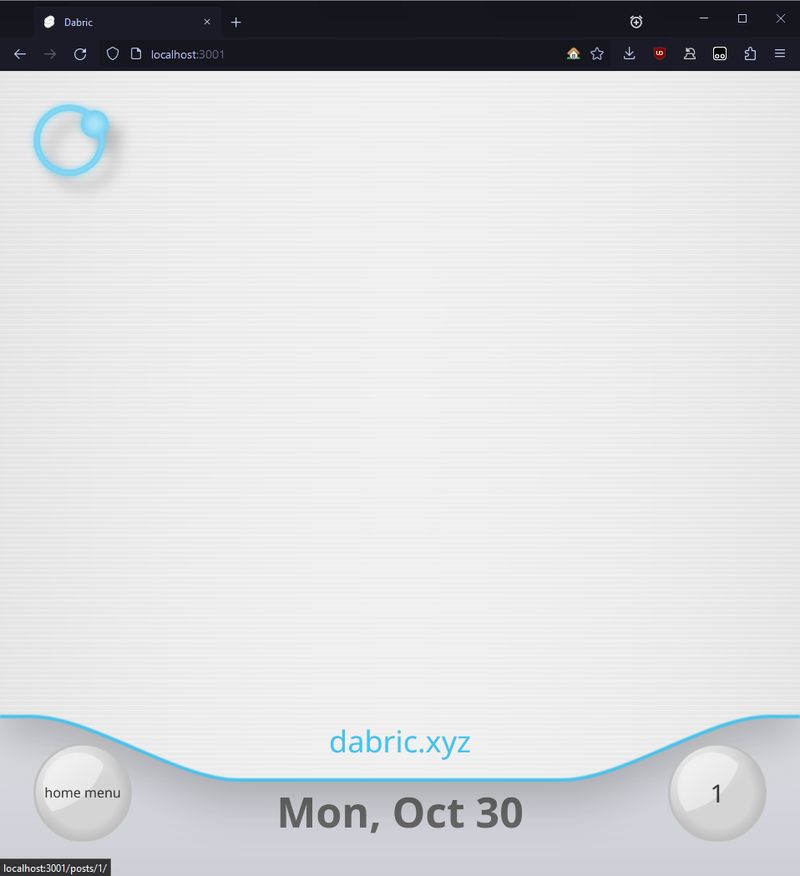
and thats all to show, really. sorry! next time, i'll hopefully be showing off some channels.
thoughts
- running a channel to recreate something and hearing music from it that has a meme status is nice. it hasn't been put through youtube, tiktok, discord, etc. its straight from the source. untouched. pure. also we dont really get nintendo system ui music anymore.
- ive been using obsidian to plan out most of revweb, which is something i haven't done until recently. hell, i didnt even do that with the start of v2. and that resulted in it become a bit of a mess once again.
- im grateful planning tho. it feels way more rewarding, and i dont feel as stressed.
- that also means you cant see internal documentation of revweb, like you can currently do now with this website.
- i'm also planning on integrating obsidian into revweb. like instead of opening vscode to write a post, i can just open obsidian. even on my phone.
- svgs are hard. i dont know a good editor so ive just been manually coding them up.
- dabric the robot is still gonna be on revweb. he wont take over the entire homepage tho
- im unsure about website branding. like favicon and button wise...i dont just want to copy the wii, cuz then its too generic.
- also thanks to my followers on neocities and the r/neocities discord. everyone is hella nice and encouraging.
16 November 2023
so there's that.
what's here
- tech stack:
- sveltekit
- typescript
- vite
- turborepo w/ pnpm workspaces
- sass
- mdsvex
- tailwind
- animations
- the navigation is mostly done
- it supports mobile. the css isn't that deep; it renders the nav twice and just
display: nones one of them
- it supports mobile. the css isn't that deep; it renders the nav twice and just
- everything shown in the video, minus the animations, works without javascript
- from what ive seen using firefox's accessibility inspector, the site is accessible? but im not the most experienced when it comes to that.
- the backend side of things for posts are pretty much done. like pagination, tags, markdown, etc.
- the message board im calling the postboard cuz they're not messages
todo
in no particular order:
- dark mode. itll be fun to figure out a non-js solution :)
- more assets
- a biggie is that one glossy button
- channels.
- theyll be used for big things. about me, that discord pfp previewer, linkcircle, etc
- when you click on a channel, you still get the regular wii menu layout, but now there's a post to go with it when you scroll down oooo
- how pages will work idk. due to varying page sizes i dont think the regular movin' right and left like on the wii will work.
- common library across websites
- achievements
- the home menu
- the home menu
- its the menu that appears when you press the home button on the wii, not the wii system menu that you see when you turn on you wii.
- how itll be opened now that there isnt a home button, im currently not sure
- achievement progress replaces the wii remote settings
- more with posts
- threads. like a post can reply to another post and it forms a thread. like on that one platform everyone seems to not want to mention
- thumbnails
- previews. currently shown in the video on the memos as just "unimplemented"
- implementing pages and tags on the frontend
- a mix between infinite scroll and pagination would be neat.
- next and previous buttons for when viewing a post
- image optimization
- shiki twoslash
- some way to offload building so its as easy as
git pushto have my website build and be uploaded
